Welcome to our artists interview series - There's no Magic without art - where we talk to artists about their work on Magic: the Gathering.
Today we share with you our talk with Joseph Meehan, and here's what he told us.
Hi Joe! tell us a bit about how you got started.
I've drawn my whole life, I come from a family of people who draw, my Dad was an illustrator, my Mom is an Art Director in advertising. I ended up going through the Toy Design program at the Fashion Institute of Technology, and got a job at Mattel, in the Boys Action Department, where I worked mainly on Batman.
I always wanted to be a concept artist and an illustrator, so in the evenings I worked hard to create a portfolio. Mattel would send employees to Comic-Con every year, and in 2013, I went knowing that Wizards of the Coast (WotC) interviews artists there. My interview went great and within 8 months I got my first commission.
What paintings were the hardest to do?
The ones that have a lot of figures in it, all trying to tell a specific story. Characters take a long time to draw. Natural environments are always easy and fun to do, but if you have four characters all interacting with each other, now that's a real pain the ass! [Laughs]
For every character you must design the costume, and you want them all to be unique and cool, so the decision about what you're going to draw takes a long time, not the drawing itself.
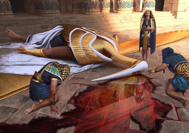
A specific card I didn't like doing and wasn't happy how it ended up was Confiscation Coup. It was a complicated story to tell, and a complicated scene to draw.
What cards were the easiest?
The simpler cards are the ones you can visualize more easily, if it's just one character. Sometimes the Art Description (AD) is just "draw the character and make them look cool".
I did the invocation for Hazoret the Fervent, and that was basically the AD. So yeah, for cards like that you can do a certain low angle, hero shot with the white light behind them.
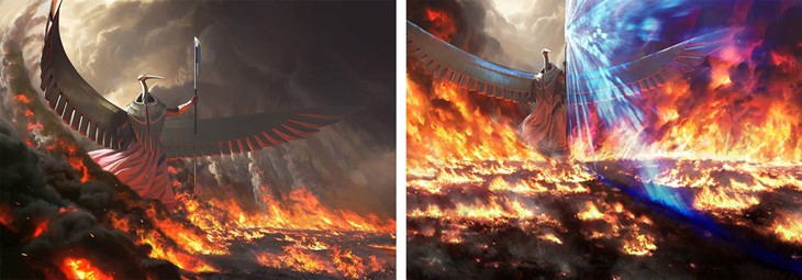
How was it to paint the 'Spell Pierce' Invocation?
I found that illustration kind of difficult, it was hard to get across what exactly was happening. He's supposed to be splitting this wall of flames and the original illustration was not telling that story clearly enough, even though I do like it better.
I had a lot of that scene mapped out on 3D, and it was very easy for me to just rotate the camera, and then paint in the flames again. So, even though it sounds like it's like a huge job to completely redo an illustration, for that one it actually wasn't quite as hard.
Can you give us a brief description of your work process?
I always take a photo of myself or, if it's a woman, take a photo of my wife. Then I go into Poser, and try to duplicate it. But, because I'm not muscular, and usually I'm called upon to draw heroic muscular men, I use a software called Anatomy 360: they have body scans of body builders, so you can get the references for muscles and that. Then, I'll put it into KeyShot, the rendering software. If there's buildings in the background I'll always build the buildings in 3D.
You painted the new Saga card 'Phyrexian Scriptures' in acrylics, which is something you don't normally do. What can you tell us about this painting?
Around that time they sent me that commission I had started considering doing some traditional paintings for Wizards, because the originals are worth a lot of money. Even though I don't play the game, I knew this was going to be an important card. They were VERY specific on this one, more specific than they are on most cards.
It was an easy card to design. They sent me Dark Ritual - the card they were referencing - but wanted a human hand instead; they also showed me some examples of Phyrexian stuff, to make it 'Gigoresque' (to reference HR Gigor), and I noticed that this stuff they were showing me, these massive hoses and bones, was not symmetrical.
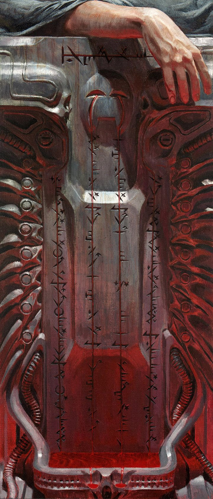
I decided that a symmetrical image would be more impactful for this sort of outer worldly look, and to make it look like an altar. The text was laid out exactly how you see in the card, and the words in the middle needed to be emphasized, so I decided to put them on that raised section.
I ended up with a render that looks very much like the final thing. I painted it on a canvas, which - I found out later - is not what most Magic artists do. Most Magic artists do a digital sketch, print it out on this heavy paper, and then basically glue it to a board and paint over it. This is a really good way to go about it, and it's what I'm going to do in the future.
But I redrew the whole thing on a canvas using a pencil. I used this grid technique where I lay out a 10x20 grid over the KeyShot render, drew a bigger grid with the same aspect ratio on the canvas, and then drew it in by hand just by looking at it.
What's the main difference between digital and traditional painting?
You know, the thing with digital is you can lay down color and stuff faster, and you can end up with something that looks pretty passable faster.
You also have more flexibility...
Yes, but that's the Achilles heel of digital. You have more flexibility, there for you have more opportunity to second guess yourself. I find myself going back and forth a lot on things, you have so much freedom it can really eat up your time. It's like the more advanced the technique, the more time is wasted. Now that I've been incorporating much more 3D into my work, I'll sit there for hours moving the camera around the model by tiny increments until it's just the right. And no one notices this, but I do.
We want to thank Joe for taking the time to talk to us. You can find Joseph's work on his Artstation, and follow him on Facebook, Instagram & Twitter.