If three fans show up unannounced at your door, you're doing well.
That's probably what was going through Melissa's mind in 1993, the year Magic: The Gathering released it's first ever expansion: Limited Edition Alpha.
Melissa A. Benson, one of Magic's original 25 artists, worked on the game for several years and illustrated more than 60 Magic cards.
Here's what she told us.
Tell us a little about how you got into art, and Magic more specifically.
My very first job out of college was drawing futuristic lawn care equipment. There was a placement agency in Connecticut for artists which placed me as often as they could; it was difficult for them because they don’t place illustrators, they placed graphic artists. Most of what they ended up giving me were advertising jobs where the client needed sketches.
I was constantly sending out samples of my work. And a well-designed response card is very important. The comments you get back can be interesting. “Nice work.” “Happy New Year.” “Good luck in your career.” Thanks – you’re not helping it any! So I sent out query letters to companies that I thought my art was a good fit for. Jesper [Myrfors, Magic's first art director who we also interviewed] got back to me.
What was your first card assignment?
We really weren’t assigned cards. Jesper called up with a list of titles and we chose what appealed to us. For me that was the original 7 I did for the first set. I passed up a few beauties, though.
Which ones?
Let’s see… Lord of the Pit; Pearled Unicorn; Northern Paladin; Earthbind , probably a couple more. I only took 7 because that was all I could afford to spend time on, for what we were being paid. I had to spend my time doing samples for publishers of fantasy paperbacks for cover work. That was what I intended to do right out of college. As they say, if I knew then what I know now… I’d have taken a lot more than 7. I made up for that with Ice Age and Legends.
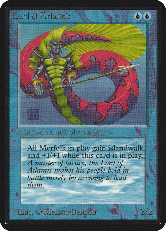
As one of the original 25 artists working on Alpha, when did you first realized that the game was blowing up in popularity?
When my royalty checks started coming in. Regular funds coming in made it more real. That, and when fans begin contacting me. I don’t play the game so I wasn’t aware of how popular it had become. Also I was being invited to shows. Most shows I passed on because they were on the west coast, and attending meant time away from the board. One time Jesper told me “ I don’t think you know how popular you are.” That’s when I started to pay more attention.
How did it feel at the time?
It felt… odd. Especially when 3 fans on bicycles showed up at my house one day unannounced. I wasn’t home at the time, but I heard about it.
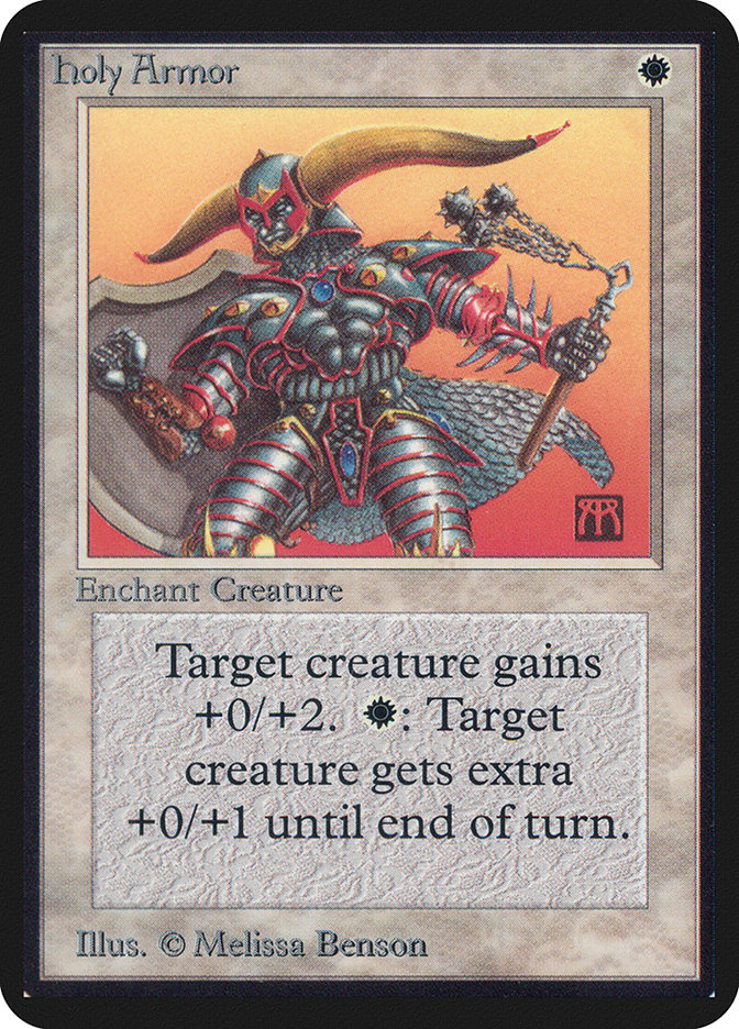
Give us a brief description of your painting process for Magic.
It is the same for every piece I do. Thumbnails, gather reference, modify, sketch, color study, transfer, paint, rinse, repeat.
For Magic it also included constantly referring to the reducing glass to make sure everything read well at such a small printed size. Details that would get lost, or muddy the design were simplified or dropped out.
In the beginning, there was no guide as to what the content needed to be. We did whatever the title suggested to us. Jesper was the man who assured that there was continuity across so many pieces. Not an easy job, but he did it very well.
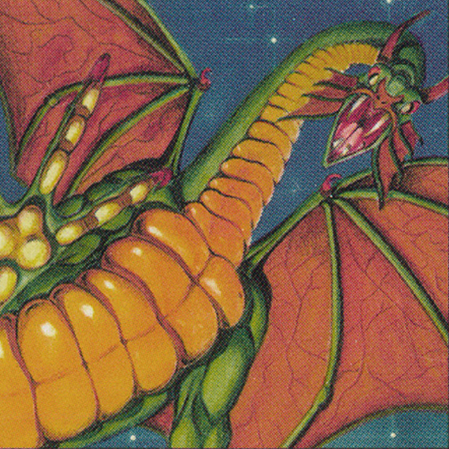
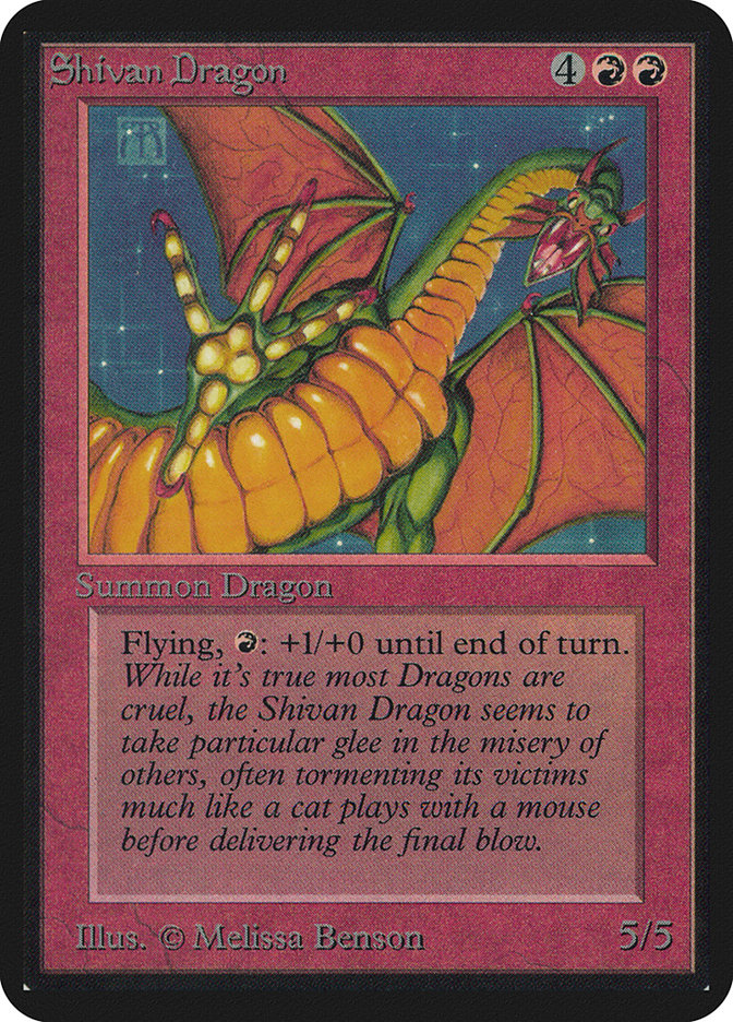
You painted the iconic Shivan Dragon. The perspective is spectacular: the dragon is standing opulently in the air, ready to step on the viewer..
Actually, he is going to grab the viewer… But stepping on the viewer works too. The little story I had in my head was someone out camping when they hear a noise. He grabs a lantern to investigate, raises the lantern and looks up to see this huge dragon’s claw reaching down for him.
The light source is coming from below which is why the shadows go in the direction they do, and the claw color is a brighter yellow than the yellow on the neck by the head.
In some artworks your signature is embedded in the setting; in others, it is aligned with the colors, sometimes contrasting, sometimes in the corner, others in the middle. It seems like signing became a deliberate part of the painting, and not just something you added on top.
I wanted to do paperback book covers, and in that industry, the publisher would often drop the artists’ signature because they didn’t want the public to associate the art with the artist, but rather with the publisher.

My solution to that was to make a signature that was more trouble than it was worth to get rid of. I made it see through, and put it in different spots on the painting so that they would have to reproduce what was behind the signature.
And sometimes, as you mentioned, I would make it part of the painting to make it even harder to get rid of.
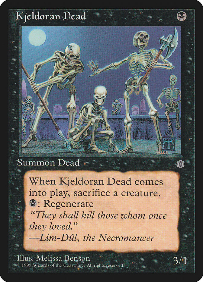
In Kjeldoran Dead, why is one of the skeletons asking the others to wait?
He is asking the others to wait while the one crouching studies the tracks of their prey. Ya gotta have a plan, ya know?
What’s something few people have noticed about one of your artworks?
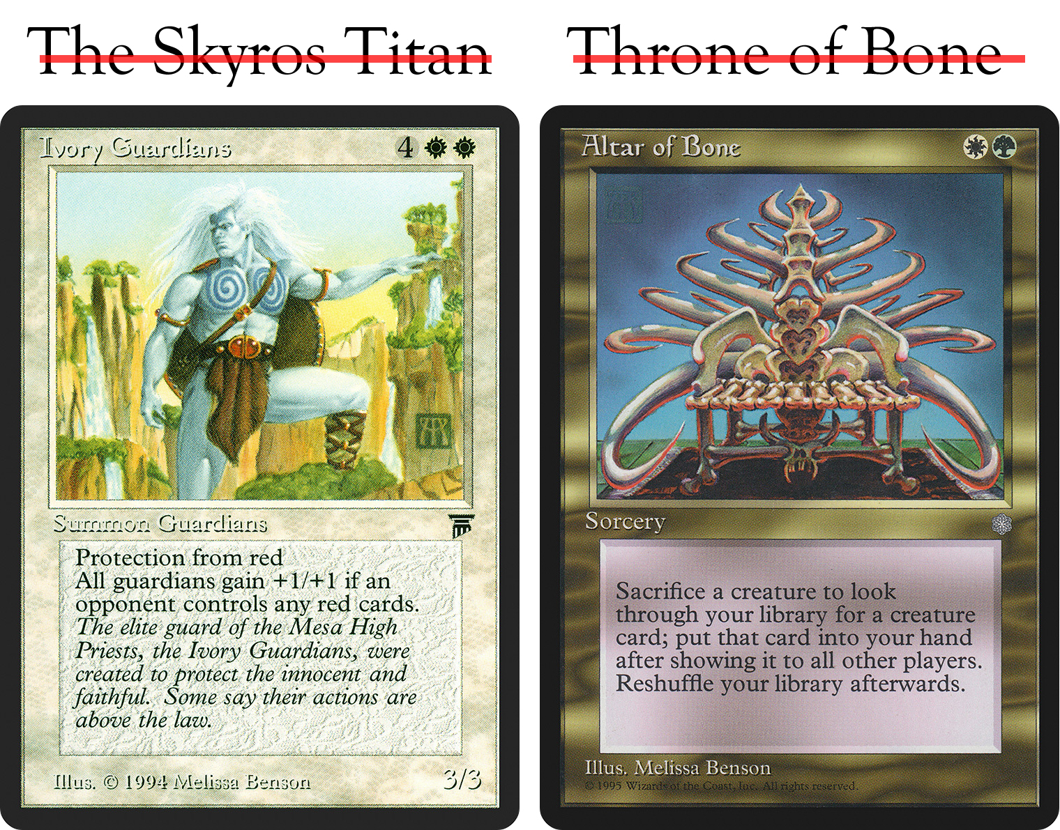
Let me take this opportunity to voice a pet peeve. There were many titles that were changed to the title you know. Sometimes theses changes made no real difference. The Kjeldoran Dead was originally The Skeletons of… Morej or something like that. But other changes made it look like I had no clue what I was doing, and that really frosts me. The most glaring example of this is the Ivory Guardians. I took this card with the title The Skyros Titan.
So if you ever wondered why he is blue and not ivory, and why there is only one character instead of a couple, this is the reason. Honestly, if the name had to be changed, would it have ruined it to call it the Azure Guardian so I didn’t look like I wasn’t paying attention? And by the way, Altar of Bone was Throne of Bone.
What were some of the most challenging cards you painted, and why?
It is always challenging to make something look big in a horizontal format. It is much easier in a vertical format. The final size makes the illusion difficult as well. There has to be something for comparasion which is smaller.
This makes it really tiny on the card, and that tiny object still has to read as what it is. Segovian Leviathan wasn’t too bad, I added blue whales, a known size, but Mountain Titan, and Ivory Guardians were more difficult. The Mountain Titan is crouching and he is flanked by two cities, and the Ivory Guardians has waterfalls.
On the other hand, what were the smoothest paintings, from the art description to the final piece?
It may not look it, but Syphon Soul and Alluring Scent didn’t give me any surprises. No surprises was always the best I could ever hope for. This is because before Magic, I worked in oils, usually around 22 x 28 inches. The Magic pieces were very small, roughly 6 x 7 inches.
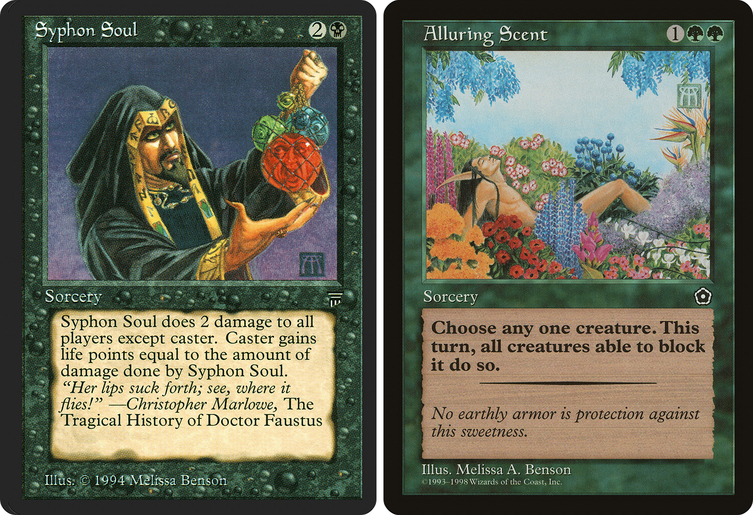
I couldn’t paint in oils that small, as tightly as I wanted to, so I switched to Dr Martins Dyes and colored pencils. I used dyes for their color saturation, and colored pencils for the details. This mixed media system has problems of its own because some dye colors do not play well with some pencil colors.
Of the art you made for Magic, can you name some favorites?
I can’t really. I wouldn’t have picked them if I didn’t like them in the first place. Some came out better than others, and I certainly liked that.
Is there any Magic related stories you’d like to share with us?
They say you should ask yourself these three questions before you say something that might be controversial: Does it have to be said, does it have to be said now, and does it have to be said by me. Now isn’t the time for my stories. Especially in print. Maybe someday.
What impact has Magic had on your career?
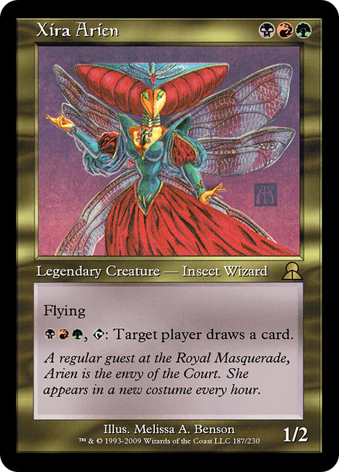
It made me a big fish in a little pond. It made it easier to get work from other games. Shadowfist, Galactic Empires, Doomtown, 7th Seas, Dragon Storm, Middle Earth, and Camelot Legends. Dragon Storm was the most fun. Companies came to me which saved me a ton of time. And I had fans. I really do appreciate the fans.
They are so enthusiastic and upbeat. It used to bother me to have strangers come up to me and to ask for a picture. Now I see that it is an expression of appreciation for the work that I do. That is very satisfying and never gets old.
Where can our readers find more about you?
I have a website: melissabenson.com. There is an about you section, which I should probably update, and the interviews section should give some insight.
Note: An excerpt of the first answer ("My very first job ...") was adapted from a previous interview in order to give more information, with Melissa's permission.
