Welcome to our interview series (#20), 'There's No Magic Without Art'!
For this week's interview we had the pleasure of talking with Steven Belledin, who shared with us the stories behind his craft.
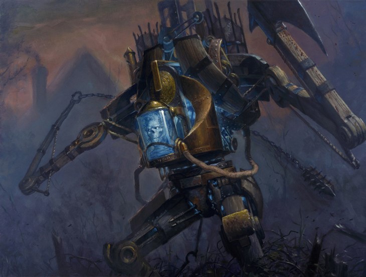
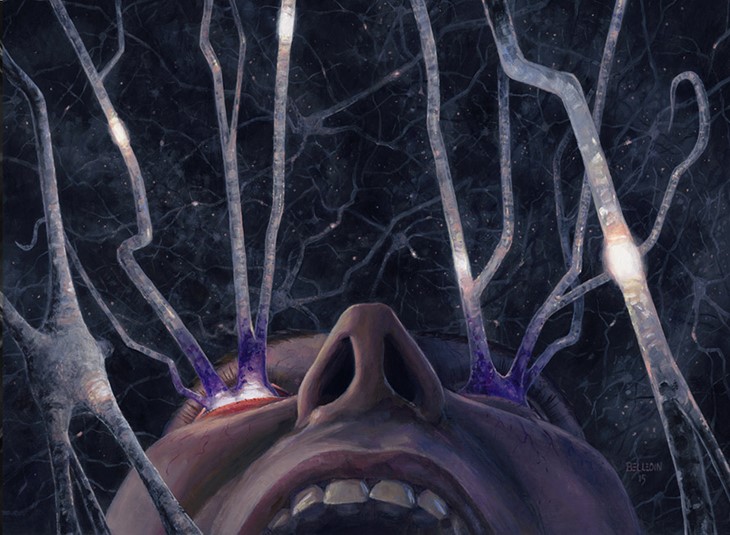
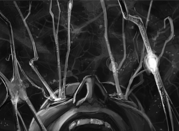
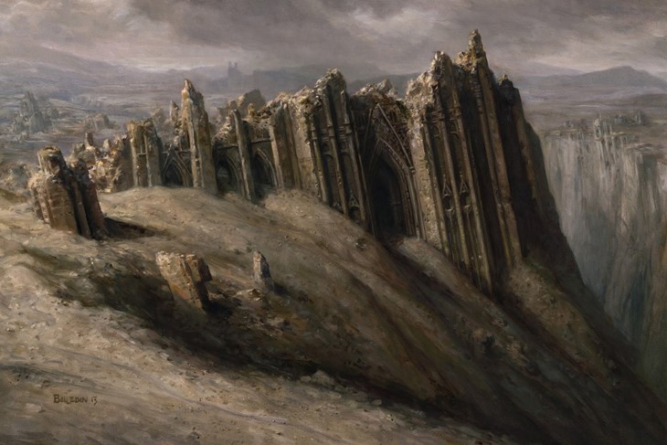
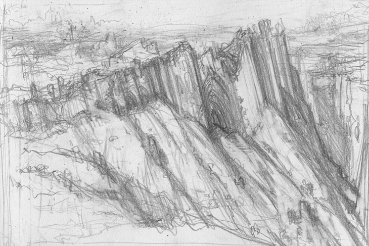
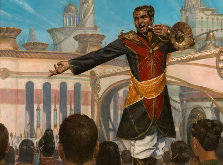
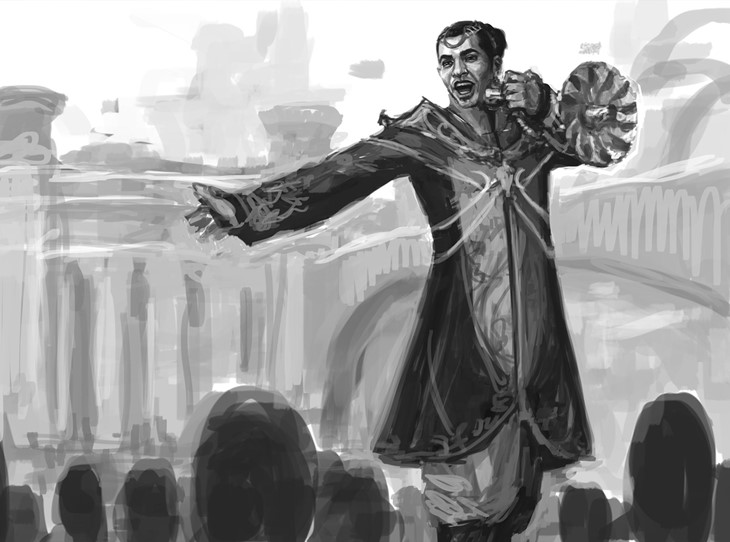
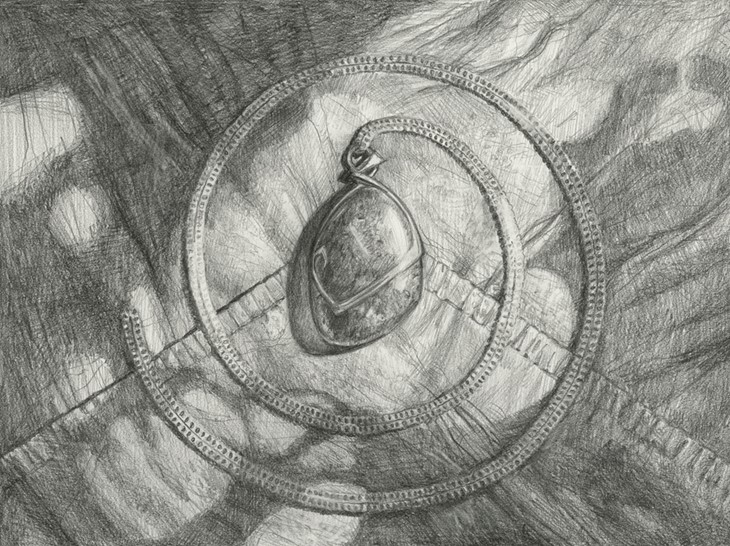
We used several images present on Steven's blog, which we highly recommend you check out.
Here's what Steven told us:
Hi Steven. Tell us a little about how you got started working on Magic.
I got into Magic through working on Dungeons and Dragons. I'd been doing DnD art for years and in the process worked with several different art directors. I happened to be in Seattle for a friend's wedding and so I decided to go and meet all the people I'd worked with in person.
I also used that opportunity to get in and see the Magic art director (who was Jeremy Cranford at the time). He interviewed me, looked through my portfolio and was brutally honest in not liking a lot of what I'd done. Fortunately, there were pieces that he did like and he brought be on board as a Magic artist as a result. The first set I worked on was Coldsnap.
Can you give us some insight into how you conceptualize a Magic card, from the art description to the first stroke?
When I get an art description, the first thing I do is read it over and over again. If it references images in the styleguide, I take a look at those too. Then, I stop looking at the description and the styleguide and I let my mind wander. Before too long, images start to appear in my head.
These images are largely the result of what I take in. Comic books, movies, cartoons, photography, other people's art, television shows, landscapes and cityscapes I've seen, places I've been to and books all contribute to the images swirling in my head. As I'm trying to pin down what I want to do with a Magic painting, my brain takes little bits from all these various sources and melds them together.
These mental images often come in very quick flashes'sometimes as still images, sometimes as one or two seconds of motion'and I sometimes have trouble capturing what I just saw in my head. Usually, though, while my brain is doing all this, I am sitting there with my sketchbook making very rough drawings. I say "drawings," but they're actually just scribbles and random marks.
As time goes on, the images start to coalesce into more legible thumbnail sketches. After I've started to latch onto a general idea, I go back and reread the art description yet again and reexamine the artwork in the styleguide (again, if there is any). This is a way for me to recheck my thought process and make sure I'm still on the right track.
From there, I start to refine my scribbles into an actual image. Only after I get the idea to a point that I like do I go forward to a finished sketch. Sometimes I have more than one idea, or more than one point of view of the same idea and I'll do multiple explorations.
But in the end, it's rare that I submit more than two sketches. Most of the time, though, I submit just one. Then I send these sketches off to the art director and await their reply. If I get approval, I start painting as soon as I possibly can because painting is my favorite part.
What makes for an exciting art description?
I am a problem solver by nature and solving problems is what makes illustration a fun career to me. With art descriptions involving pre-determined visuals, a lot of the "problems" of the illustration are already solved.
So, I prefer any assignment that involves getting to actually design elements within the finished image. In short, I like using my brain and the more I have to figure out and create within a given job, the more exciting it is to me.
Why did planes like Kaladesh and Theros felt to you more distant aesthetically, and what were your favorite planes to work on?
Kaladesh is a world whose visuals rely heavily on a lot of ornate and decorative design. I don't really like that kind of thing because decoration has no real purpose. I prefer more practical design because it makes more sense to me and tends to feel more usable and real.
The more decorative things become, the more distant the feel to me personally. I don't know why, but that's just always been the case for me. A banged up, rusty or greasy gear is always going to be more interesting to me than the filigree-covered gears of Kaladesh.
Theros was a different issue in that the world felt too close to its inspiration to me. Ancient Greece is interesting, but I wished they'd pulled the aesthetic further into the world of Magic.
I know that Wizards wants to continually broaden the boundaries of what Magic's aesthetic is, but for me, Theros felt too much like actual depictions of Greece and its mythology and not enough like it belonged to Magic. In a way, it felt more to me like doing historical painting than fantasy painting.
Of the many planes I've had the privilege of working on, Mirrodin is near the top of the list of my favorites. Well, Phyrexianized Mirrodin, anyway. I really enjoyed working in that world and I can't think of a plane that Magic has ever gone to that is more unique and more "ownable" as a Magic plane.
I also feel like I painted some of my best work for those sets. Ravnica is another place I like a good deal. Unfortunately, every time we've gotten to visit that world, I have things going on in my life that prevent me from taking on as much work as I'd like, and so I have only a few paintings set there.
If I had to choose just one plane, though, it would probably be Innistrad. I've had a lot of fun working on the paintings for that world, and I hope it's a place I get to go back to again someday.
How was it to work on the Concepting team for Innistrad, a fan favorite set?
Concepting in general has been a blast. It's a very intense experience that is inspirational and also exhausting. I've had the privilege of working on Kaladesh, Ixalon, Dominaria, and Tarkir as well, but all of those experiences can't top working on Innistrad.
Part of that is because it was my first time doing concept work. Part of that is that it was the first time I got to work alongside other artists. The rest of it is that Innistrad really fits well with my work and my sensibilities and is a place that I could really sink my teeth into.
Drawing things for that world was almost second nature to me. While there were certainly challenges, they weren't frustrating ones, and collaborating with Steve Prescott and Mike "Daarken" Lim made solving any problems interesting and exciting.
We were constantly bouncing ideas off of one another and helping to make one another's ideas even better. There's a part of me that wishes I had that all the time, but then my studio would be too crowded!
You also mentioned that Demolish was an unexpectedly hard card to paint. The First Eruption resulted in 'severe hand cramps and occasional hand spasms'. What makes a card challenging, and what - on the other hand - makes it 'a breeze' to work on?
I had a teacher once tell me that when one has finished an illustration, what one has learned is how to paint that specific illustration. While there are lessons one may take from that illustration into the next illustration, the combination of problems one had to solve will never be the same again. I've found that my teacher was generally right about this.
I know how to paint metal, but the combination of the metal, the lighting, the shear amount of detail in Demolish, made it very hard to paint. The First Eruption, meanwhile, was a test of endurance. Sometimes I know what the challenge in a piece is going to be. Often it's the lighting or the amount of detail. Other times, I find myself in the middle of the piece suddenly realizing that I'm stuck.
Fortunately, we live in an age where I can take a photo of the painting in progress, import that photo into Photoshop and digitally paint on top of it to figure out what my next step will be.Then I can take the solution to the easel and paint confidently. The reality is that the biggest factor that has made Magic paintings challenging has been the passage of time.
When I first started working on Magic, the illustrations were simpler and required less detail. Over time, the amount of detail and the level of realism have continued to increase and it's frankly very hard to keep up. The simpler an image is, the easier it tends to be. To this day, the fastest I've ever painted a Magic piece was two and a half days and that piece was Deathmark.
Why did it take so little time? It's essentially just a close-up of an eyeball. While there's still a lot of detail in that piece, the image is primarily made up of large, simple shapes. If you look at most recent Magic illustrations, the shapes tend not to be large or simple.
The illustrations are increasingly detailed and chock-full of stuff. The more stuff a painting contains, the more problems there are to solve and the more time these images take. So it's the combination of those things with the ever-looming deadline that tends to make things so challenging.
Of the art you made for Magic, can you name some favorites?
Surgical Extraction, Rampant Growth, Overgrown Tomb, and my original basic Forest are among the favorites that have been released.
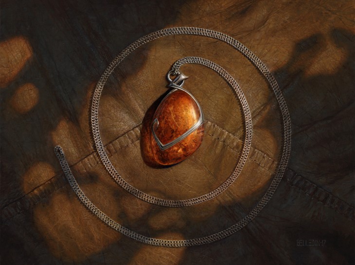
You said about Mox Amber that "it's not exactly shouting its value or power, either. It is, in many respects, the perfect example of my aesthetic philosophy". What other aspects define you as an artist?
In general, I like to keep things pretty simple and real. The things I am asked to depict are generally very unreal and so I don't like to make those things feel inauthentic with extreme points of view or exaggerated perspective.
I try and depict things in a very straightforward way as though the viewer were standing there, actually seeing the things I'm trying to show them. I try and let the subjects of the images call attention to themselves naturally.
Also, I tend to dislike lots of bright color (which may be another reason I don't feel completely comfortable in Kaladesh). I like seeing the bright colors in the work of other artists, but it feels very unnatural to me. So I tend to stick to more muted tones whenever possible and limit the amount of bright hues.
We recently saw two new pieces from you on the Core Set 2019. How did it feel to work on them?
Both were a lot of fun, honestly. I don't think of myself as a creature designer, but more and more I'm finding that I'm asked to do just that. Obviously Wizards likes what I do in terms of creature design, and hopefully the audience does too. Additionally, I got to create these creatures from scratch, so both were a lot of fun.
The new version of Vaevictis Asmadi was especially interesting and fun since it was an existing character that needed to be reinvented. Wizards provided some very basic guidelines, but I was essentially free to do whatever I wanted with him. I felt pretty honored to be given that degree of trust.
For our last question, is there any Magic related story/episode you'd like to share with us?
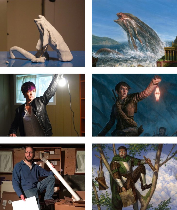
Sure! I need to start by saying that my sketches nowadays are largely digital and almost fully rendered out. They're pretty elaborate (though not as detailed as finished work) and pretty clear for the most part. That wasn't always the case.
My sketches used to be quite bad and to some extent open to interpretation. This could sometimes be problematic but also led to a funny incident. Well, I found it amusing, anyway.
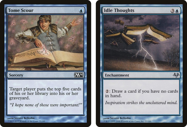
The paintings I did for Tome Scour and Idle Thoughts are strangely related to one another because of my poor sketches. Tome Scour was one of the first Magic paintings I ever did, but it was for a card that didn't get published and so it was kept in Magic's art files waiting for the day it could be used for a new card. I submitted two sketches for Tome Scour.
The first was a sorcerer magically pulling the printed words off of the pages of a book and is what the painting was based on. The second sketch depicted the words falling out of the same book as the book was being shaken by the sorcerer. For some reason that second sketch really stuck in the art director's head.
A couple years went by and I was assigned the art for Idle Thoughts. The art director asked me to paint the second sketch I submitted all those years ago of the flying book. I was confused and had no idea what he was talking about. I had never drawn a flying book. So he called me on the phone and tried to jog my memory. It took a while, but I finally understood that he meant the unused sketch for Tome Scour.
I looked at the sketch and I realized that he wasn't wrong and that it really did look like a flying book. I pointed out to him that the book wasn't flying but rather the words were being "poured" out of it. Obviously that's not what he saw in the image I'd created. It was at this point that I realized I needed to start making my sketches a bit clearer so art directors could properly interpret my intentions.
We're incredibly grateful to Steven for taking the time to share his passion with us.